Design has many languages. Architecture speaks through form and space. Typography communicates through the rhythm and weight of letterforms. Music uses the relationships between notes over time to create structures that convey emotional meaning. Jewellery design has always had its own language too, the language of material, of form, of scale and proportion. But one of the most interesting and least discussed of these languages is the language of colour sequence: the deliberate ordering of hues across a piece to create effects that go well beyond simple decoration.
What Does Sequence Mean in This Context
Colour sequence in jewellery refers to the intentional arrangement of different coloured stones or materials in a specific order that creates a visual progression the eye follows across the piece. This is distinct from simply combining colours, which any jeweller working with multiple stones does as a matter of course. Sequence implies direction, a beginning and an end, a journey the eye takes from one chromatic state to another.
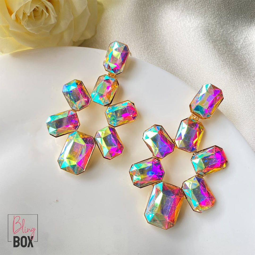
The simplest form of colour sequencing is the spectral progression: red, orange, yellow, green, blue, indigo, violet, the order in which colours appear in a rainbow or when white light passes through a prism. This sequence has a quality of naturalness and inevitability that the eye finds deeply satisfying, because it corresponds to the actual physics of light. Rainbow jewellery that follows a true spectral progression taps into this satisfaction directly, producing a visual coherence that feels not just designed but in some sense correct.
But spectral progression is only the most obvious form of colour sequencing. Designers working at the highest levels of the craft use a much broader vocabulary of sequential strategies, each producing distinct visual and emotional effects.
Why This Language Matters for Wearers, Not Just Makers
Understanding colour sequencing as a design language matters for anyone who wears jewellery, not just those who make or collect it. When you know that a piece has a sequential structure, you begin to look at it differently. You notice the direction the eye is led, perceive the beginning and end of the visual journey, and understand why the piece feels dynamic or calm, why it seems to have energy or depth, and why it holds your attention in ways that simpler pieces do not.
This understanding also informs how you wear and combine pieces. A piece with a strong sequential structure places different demands on an outfit than one that uses colour as a pattern or accent. The sequence is a dominant element that rewards space to breathe. Wearing it against a simple background allows the sequence to do its full communicative work rather than competing with other visual elements.
There is also a practical dimension to understanding colour sequencing when shopping for or commissioning jewellery. Knowing what to look for means you can distinguish between a piece genuinely designed around colour sequence and one that has simply combined attractive stones without coherent sequential logic. The former will continue to reveal itself over time, offering new visual experiences as light changes and as you become more familiar with each stone’s position in the sequence. Rainbow jewellery built on genuine sequential thinking is never fully exhausted by a single viewing. It has depth that accumulates rather than diminishes, and that quality is one of the surest signs that a design decision has been made with real creative intelligence rather than simply with good taste.